
Security data analytics and visualization with R
Data Analysis
In this era of massive computing environments, cloud services, and global infrastructure, it is reasonable to call data "big," although this is the first and last time I'll do so in this article.
The issue of massive data volume driven by scale is not new; the problem space has simply evolved. Data challenges are just more prevalent now given that even a small business or single user can generate significant data, because processing power and storage are commodity items easily attained. Even though it's a subset of the larger sum, security data is no less daunting, and given my bias, in many ways more important to manage, process, maintain, and analyze.
In a quest to conduct better analysis in massively dynamic environments, I embraced R a few months ago and now live in a steady state of epiphany as I uncover new opportunities for awareness and visualization (see the "Coursera Data Science Specialization" box). I've read several books while undertaking this endeavor, and one of the best and most inspirational is by Jay Jacobs and Bob Rudis [3] [4]. These few months later, my R skill level has improved just enough to share some insight with you. Imagine me as somewhere between total noob R script kiddie and modestly creative practitioner.
To that end, let me offer a bit of what I've learned; however, recognize that my background has long been security operations and analysis. I am by no means a developer, and it's even likely my code will offend those of you who are. This article is intended as a tool for those among you who, like me, are on the low end of the learning curve in this regard. Consider this an introduction, laced with proofs of concept and build-your-practice evangelism. Herein, I'll describe three security data and analysis scenarios, the intent of my analysis, and the related R script and result. All data samples and code can be downloaded from the Linux Magazine FTP site [5].
Strategy
One of the most important tenets of good data analysis is creating useful datasets and visualizations that allow discovery and increase awareness. R allows data scientists and analysts to do so in powerful ways. This is all the more useful in the information security arena because skill levels and depth of understanding vary greatly. Penetration testers and chief information security offices (CISOs) do not often speak the same language; however, a dataset derived from the results of a penetration test that is well represented in a meaningful graphic created with R helps both parties cross the technical divide.
To begin, I'll give you an R primer that assumes a Xubuntu Desktop 12.04.4 LTS instance. If you're not familiar with R, the R Project for Statistical Computing states: "R is a free software environment for statistical computing and graphics that compiles and runs on a wide variety of UNIX platforms, Windows and MacOS" [6].
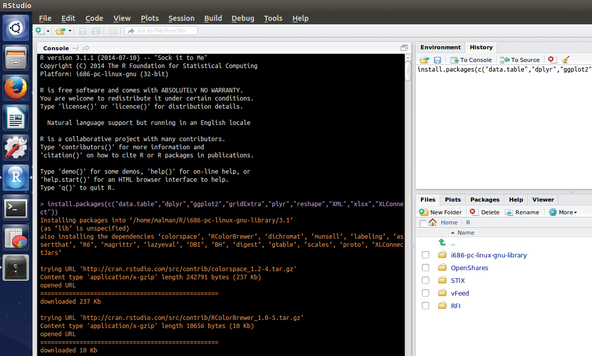
With R installed, system issues resolved, and package dependencies met (see the "R Installation and Resources" box), I'll proceed with the first scenario.
RFI Attack Analysis
The first scenario is relatively straightforward with a simple, yet real-world, dataset and a small script that packs in some great fundamentals.
My website, holisticinfosec.org, is scanned and probed on a regular basis, as is common for all Internet-facing resources. One of the attack patterns regularly noted in logs represents remote file include (RFI) attempts. An excellent example of this attack, including a description, walk-through, and exploit is available at Exploit-DB [11].
Over the years, I've made use of a Perl script that reduces very long W3C Apache log entries down to just the basics needed to analyze RFI attacks, including a date and time stamp, the IP address, and the attack string. The file rfi-extract-July2011.log (Figure 2) represents just such a reduced dataset from July 2011, which will serve as the first example.
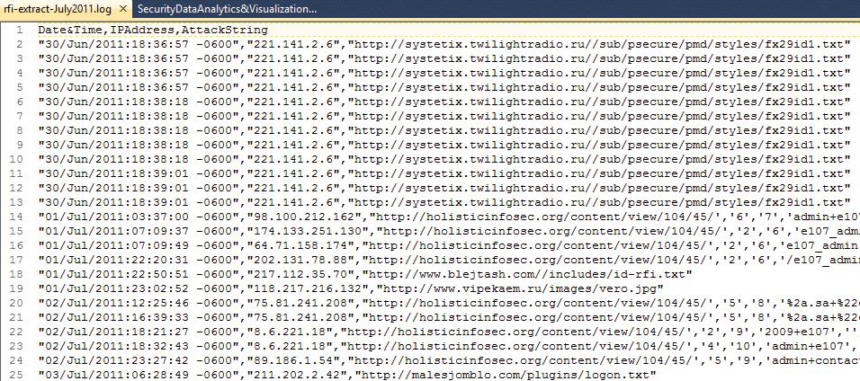
rfi-extract-July2011.log).If you'd like to start with a tidy view, Ctrl+L clears the RStudio console of all the package installation text. For the first exercise, copy Listing 1 to a new script tab: Use Ctrl+Shift+N or click the plus icon in the upper left corner and select R Script from the drop-down menu.
Listing 1: RFIviz.R
01 ## Plot Top 10 IP addresses from RFI attacker logs
02 ## Russ McRee, @holisticinfosec
03
04 library(data.table)
05 library(plyr)
06 library(ggplot2)
07
08 setwd("~/R/RFI")
09 rfi <- read.csv("rfi-extract-July2011.log",header=TRUE, sep=",")
10
11 ## read in data to frame
12 data <- data.table(rfi)
13 ct <- count(data$IPAddress)
14 srt <- ct[order(ct$freq, decreasing = TRUE), ]
15 top10 <- head(srt,10)
16
17 ggplot(data=top10, aes(x=x, y=freq, fill=x)) + \
   geom_histogram(stat="identity", colour="black", show_guide=FALSE) + \
   scale_fill_brewer(palette="RdYlGn") + xlab("IP Addresses") + ylab("Attack \
   Frequency") + theme(axis.text.x = element_text(angle = 45, hjust = 1, \
   color="blue")) + theme(axis.text.y = element_text(face = "bold", \
   color="blue")) + ggtitle("Top 10 RFI Attackers by IP") + \
   theme(plot.title=element_text(face="bold", size=15))
One of the beauties of R is the number of packages that exist to build on the R base and provide improved or more robust functionality. R is also incredibly well documented; almost every function and package help file can be called with help(), ?, or ?? (e.g., help(plot), ?plot, or ??plyr). Per each package's documentation, the data.table package inherits from data.frame and enhances it, whereas plyr represents a split-apply-combine paradigm for R, and ggplot2 is an implementation of the grammar of graphics (GG) in R that combines the advantages of both base and lattice graphics.
I set the working directory with setwd("~/R/RFI") (line 8). The rfi variable holds the data read in from the RFI logfile, a well-formed CSV-formatted file, using the read.csv() function (line 9). The data variable represents the rfi dataset as a data frame using the data.table package. Remember, you can return the results of any variable by typing it in the console. The ct variable makes use of the count function provided by the plyr package to count the number of times each attacking IP occurs in the logfile. Whereas data is the dataset, data$IPAddress represents the column of IP addresses in the log CSV file as a variable, as established by the column header. You can run names(data) which returns [1] "Date.Time" "IPAddress" "AttackString" to tell you all the column names. The srt variable makes use of the base order function to take the results of the ct variable and organize it in decreasing order by the number of times each IP address is noted (freq). Finally, the top10 variable captures the top 10 entries from the srt variable.
One thing you'll quickly learn about R is that you have numerous ways to solve the same problem. A better R programmer will likely read this and write a far better script to perform the same actions, but the point here is to learn as you go while representing information security data in useful ways.
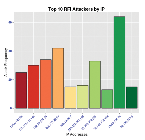
The ggplot2 line is where the rubber hits the road. The plotting options [12] are endless: line, area, bar, box, density, histogram, and many more. For a great way to learn quickly about ggplot2, refer to Christophe Ladroue's quick introduction [13]. Per the RFIviz.R script, aesthetics are assigned via aes. I've built a histogram with this example to visualize the final dataset attributed to the top10 variable (Table 1).
Tabelle 1: ggplot2 Histogram Elements
|
ggplot2 Code |
Action |
|---|---|
|
|
Set the x axis with the top 10 IP addresses and the y axis with the frequency of their occurrence; base the color fill on the IP data. |
|
|
Set the height of each histogram bar, represented by the value of counts per attacking IP address from the |
|
|
Set a black border around each histogram bar. |
|
|
Eliminate the plot legend, which is unnecessary in this scenario. |
|
|
Establish a red/yellow/green color scheme. |
|
|
Label the x and y axes. |
|
|
Adjust the angle of the IP address, along with color and font in the x axis labels. |
|
|
Set the appearance of the y axis labels. |
|
|
Set the plot title and its appearance. |
Notice that when I populate the data variable with input from rfi, the headers from the logfile are replaced with x for the IP address column and freq for the counts. These steps reduce the dataset to just what I need to conduct the analysis (frequency of attacking IP addresses). Although I lose the convenient column names and could redefine them within the data variable, I reintroduce them in the ggplot build in the final line.
Finally, to run the script, I select all content in the source pane, then click the Run button (Figure 3). It becomes immediately clear that the IP address 75.98.226.74 has made the most RFI attempts against my website during the time period analyzed. Information so clearly evident allows network defenders better options for IP banning, abuse reporting, and executive dashboards.
Analyzing Spreadsheet Data
My second scenario involves a larger dataset, spanning months, in the form of an Excel workbook with many worksheets. The XLConnect package installed during setup allows users to manipulate Excel files directly from R. If you'd like an overview of the package, you can run
demo(package = "XLConnect")
at the console for a demo. The workbook I refer to is an example file I created from one of many work streams in which teams track trends and statuses with spreadsheets. I did anonymize the data, and it will look anonymized, but the point is well made, and you can play with the data to your heart's content.
Excel does offer charting options, but the flexibility of doing data analysis with R has lead me to transition more often to R. Chris Leonard has an excellent treatise on the arguments for R [14]. The workbook includes data from each week (approximately) between July 27 and October 16, 2014. The four columns include a server count (HostCt), the number of patches required per server (PatchCt), the server owner (randomized seven-character string, ServerOwner), and the applicable date (Date), which is also the worksheet name. Figure 4 shows the source dataset.
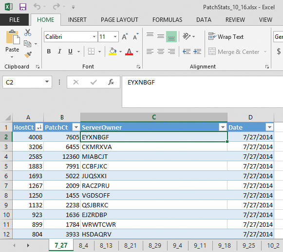
Based on the data for July 27 in Figure 4, you can see that server owner EYXNBGF clearly has the most servers in need of security patches. The question is whether that trend continues across months, which R can find out using the code in Listing 2.
Listing 2: PatchStatsTop10.v.0.3.R
001 ## Server Owner Trend Analysis
002 ## -Missing Security Patches
003 ## Russ McRee, @holisticinfosec
004
005 library(XLConnect)
006 library(ggplot2)
007 library(dplyr)
008
009 setwd("~/R/PatchStats")
010 patchstats <- loadWorkbook("PatchStats_10_16.xlsx")
011 sheet1 <- readWorksheet(patchstats, sheet = 1)
012 sheet2 <- readWorksheet(patchstats, sheet = 2)
013 sheet3 <- readWorksheet(patchstats, sheet = 3)
014 sheet4 <- readWorksheet(patchstats, sheet = 4)
015 sheet5 <- readWorksheet(patchstats, sheet = 5)
016 sheet6 <- readWorksheet(patchstats, sheet = 6)
017 sheet7 <- readWorksheet(patchstats, sheet = 7)
018 sheet8 <- readWorksheet(patchstats, sheet = 8)
019 sheet9 <- readWorksheet(patchstats, sheet = 9)
020 sheet10 <- readWorksheet(patchstats, sheet = 10)
021 sheet11 <- readWorksheet(patchstats, sheet = 11)
022 sheet12 <- readWorksheet(patchstats, sheet = 12)
023
024 ## read in data to frame
025 data1 <- sheet1
026 patchdata1 <- data.frame(data1)
027 top1 <- patchdata1 %>%
028         select(HostCt, ServerOwner, Date) %>%
029         arrange(desc(HostCt))
030 head1 <- head(top1, 25)
031
032 data2 <- sheet2
033 patchdata2 <- data.frame(data2)
034 top2 <- patchdata2 %>%
035         select(HostCt, ServerOwner, Date) %>%
036         arrange(desc(HostCt))
037 head2 <- head(top2, 25)
038
039 data3 <- sheet3
040 patchdata3 <- data.frame(data3)
041 top3 <- patchdata3 %>%
042         select(HostCt, ServerOwner, Date) %>%
043         arrange(desc(HostCt))
044 head3 <- head(top3, 25)
045
046 data4 <- sheet4
047 patchdata4 <- data.frame(data4)
048 top4 <- patchdata4 %>%
049         select(HostCt, ServerOwner, Date) %>%
050         arrange(desc(HostCt))
051 head4 <- head(top4, 25)
052
053 data5 <- sheet5
054 patchdata5 <- data.frame(data5)
055 top5 <- patchdata5 %>%
056         select(HostCt, ServerOwner, Date) %>%
057         arrange(desc(HostCt))
058 head5 <- head(top5, 25)
059
060 data6 <- sheet6
061 patchdata6 <- data.frame(data6)
062 top6 <- patchdata6 %>%
063         select(HostCt, ServerOwner, Date) %>%
064         arrange(desc(HostCt))
065 head6 <- head(top6, 25)
066
067 data7 <- sheet7
068 patchdata7 <- data.frame(data7)
069 top7 <- patchdata7 %>%
070         select(HostCt, ServerOwner, Date) %>%
071         arrange(desc(HostCt))
072 head7 <- head(top7, 25)
073
074 data8 <- sheet8
075 patchdata8 <- data.frame(data8)
076 top8 <- patchdata8 %>%
077         select(HostCt, ServerOwner, Date) %>%
078         arrange(desc(HostCt))
079 head8 <- head(top8, 25)
080
081 data9 <- sheet9
082 patchdata9 <- data.frame(data9)
083 top9 <- patchdata9 %>%
084         select(HostCt, ServerOwner, Date) %>%
085         arrange(desc(HostCt))
086 head9 <- head(top9, 25)
087
088 data10 <- sheet10
089 patchdata10 <- data.frame(data10)
090 top10 <- patchdata10 %>%
091         select(HostCt, ServerOwner, Date) %>%
092         arrange(desc(HostCt))
093 head10 <- head(top10, 25)
094
095 data11 <- sheet11
096 patchdata11 <- data.frame(data11)
097 top11 <- patchdata11 %>%
098         select(HostCt, ServerOwner, Date) %>%
099         arrange(desc(HostCt))
100 head11 <- head(top11, 25)
101
102 data12 <- sheet12
103 patchdata12 <- data.frame(data12)
104 top12 <- patchdata12 %>%
105         select(HostCt, ServerOwner, Date) %>%
106         arrange(desc(HostCt))
107 head12 <- head(top12, 25)
108
109 mergedTop25 <- rbind\
    (head1,head2,head3,head4,head5,head6,head7,head8,head9,head10,head11,head12)
110
111 EYXNBGF <- filter(mergedTop25, ServerOwner=="EYXNBGF")
112 CKMRXVA <- filter(mergedTop25, ServerOwner=="CKMRXVA")
113 MIABCJT <- filter(mergedTop25, ServerOwner=="MIABCJT")
114 CCBFJKC <- filter(mergedTop25, ServerOwner=="CCBFJKC")
115 JUQSXKI <- filter(mergedTop25, ServerOwner=="JUQSXKI")
116 RACZPRU <- filter(mergedTop25, ServerOwner=="RACZPRU")
117 VGDSOFF <- filter(mergedTop25, ServerOwner=="VGDSOFF")
118 QSJBRKC <- filter(mergedTop25, ServerOwner=="QSJBRKC")
119 EJZRDBP <- filter(mergedTop25, ServerOwner=="EJZRDBP")
120 WRWTCWR <- filter(mergedTop25, ServerOwner=="WRWTCWR")
121
122 p <- ggplot() + geom_line(data = EYXNBGF, aes(x = Date, y = HostCt, color = \
   "EYXNBGF")) + geom_line(data = CKMRXVA, aes(x = Date, y = HostCt, color = \
   "CKMRXVA")) + geom_line(data = MIABCJT, aes(x = Date, y = HostCt, color = \
   "MIABCJT")) + geom_line(data = CCBFJKC, aes(x = Date, y = HostCt, color = \
   "CCBFJKC")) + geom_line(data = JUQSXKI, aes(x = Date, y = HostCt, color = \
   "JUQSXKI")) + geom_line(data = RACZPRU, aes(x = Date, y = HostCt, color = \
   "RACZPRU")) + geom_line(data = VGDSOFF, aes(x = Date, y = HostCt, color = \
   "VGDSOFF")) + geom_line(data = QSJBRKC, aes(x = Date, y = HostCt, color = \
   "QSJBRKC")) + geom_line(data = EJZRDBP, aes(x = Date, y = HostCt, color = \
   "EJZRDBP")) + geom_line(data = WRWTCWR, aes(x = Date, y = HostCt, color = \
   "WRWTCWR")) + xlab('Date (July 27 thru October 16)') + ylab('Servers w/ \
   Missing Patches (by owner)') + guides(fill=FALSE)p + theme(legend.title = \
   element_text(colour="navy", size=16, face="bold")) + \
   scale_color_discrete(name="Top 10\nServer Owner\n Patch Trends") + \
   guides(colour = guide_legend(override.aes = list(size=3))) + \
   theme(axis.text.x = element_text(face = "bold", color="black"), \
   axis.text.y = element_text(face = "bold", color="black"), axis.title.x = \
   element_text(face = "bold", color="navy", vjust=-0.35), axis.title.y = \
   element_text(face = "bold", color="navy", hjust=0.50))
While taking advantage of the XLConnect package, I also make liberal use of the dplyr package. To do it justice, I'll direct you to an introduction to dplyr by the author, Hadley Wickham [15]. Wickham describes dplyr as a fast, consistent tool for working with both in-memory and out-of-memory data-frame-like objects (e.g., data tables, databases, multidimensional arrays). More importantly, dplyr helped me solve problems easily and conveniently that, as a fledgling R script writer, otherwise could have been over complicated. Hadley states:
dplyr aims to make each of these steps as fast and easy as possible by:
- Elucidating the most common data manipulation operations, so that your options are helpfully constrained when thinking about how to tackle a problem.
- Providing simple functions that correspond to the most common data manipulation verbs, so that you can easily translate your thoughts into code.
- Using efficient data storage backends, so that you spend as little time waiting for the computer as possible.
After loading the required packages and setting the working directory (lines 5-9), XLConnect allows me to access readWorksheet and load each worksheet, representing data from a specific date, as a variable. Here's where the dplyr magic kicks in.
In lines 25-30, data1 simply reads the data from the first worksheet, sheet1, created with the readWorksheet in line 11. patchdata1 then defines the content from data1 as a data frame. Five basic dplyr data manipulation verbs work on a single table: filter(), arrange(), select(), mutate(), and summarise().
In top1 I use the select verb to gather HostCt, ServerOwner, and Date from the patchdata1 data frame, then arrange it in descending order by HostCt. The head operation simply vectorizes the top 25 entries from the dataset. I repeat this for each worksheet in the workbook, then bind all rows of data from each week back into one dataset with rbind in mergedTop25 (line 109).
This process reduces data down only to that which is necessary for the visualization I want to achieve. The filter verb, as seen in line 111,
EYXNBGF <- filter(mergedTop25, ServerOwner=="EYXNBGF")
allows me to encapsulate data specific to server owner EYXNBGF by date and host count (Figure 5).
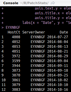
filter verb.For a much cleaner, more legible graphic, I take only the top 10 data points (ServerOwners) from my top 25 dataset for visualization and plot the variables, as defined in the filter statements, in the last line of Listing 2 with:
geom_line(data = EYXNBGF, aes(x = Date, y = HostCt, color = "EYXNBGF"))
Each plot line is colored uniquely per each server owner dataset. The theme elements tidy up and define the axis and legend text. The result is seen in Figure 6.
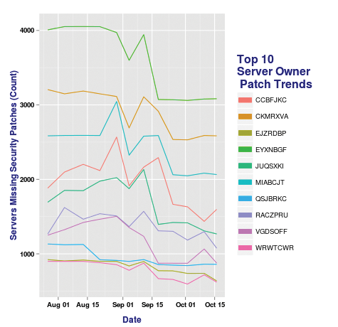
The early evidence was that server owner EYXNBGF had the most servers in need of security patches. While that remains true, since July 27, EYXNBGF has in fact reduced the number of servers in need of security patches by approximately 1,000. That represents a positive trend. A few more indicators show up, both positive and negative. CKMRXVA shows a pretty dramatic dip, as well as a noteworthy jump in missing security patches from CCBFJKC. You might be able to identify interesting anomalies with a good graphic, too.
September 4, for example, shows a dramatic, rather consistent dip on most server owner data, which is likely indicative of a failure in the data collection mechanism rather than everyone patching approximately the same amount at the same time. As such, visualizing your data allows good trend analysis, as well as potential failure detection. It really begins to exemplify the value of working with R for security data analytics and visualization.
R XML Translator
The last scenario is less about visualization, although it is an effort to make machine-readable code human-readable, which in itself is a sort of visualization.
In my line of work, data from tools such as vulnerability and service scanners, as well as threat intelligence and information sharing resources, is exported in XML format. XML is fabulous for machine-to-machine conversations, but a human analyst might not have the means to "translate" such a file, such as the appropriate application to import it with or the XSLT needed to render it in a human-readable manner via a browser, for example.
Another file type that falls into this category is the STIX (Structured Threat Information eXpression) file, which was developed by Mitre and often shared via the TAXII (Trusted Automated eXchange of Indicator Information) transport mechanism. Although I've written an R STIX translator, I do not have a good sample file to share for a demonstration (most STIX-based threat intelligence information is not meant for public consumption), so I need a similar exemplar.
Luckily, my friend and compatriot in all things security tooling, NJ Ouchn (@toolswatch), wrote vFeed [16], which exports Common Vulnerabilities and Exposures (CVE) as XML data. Per the toolswatch GitHub page, the vFeed framework "provides extra structured detailed third-party references and technical characteristics for a CVE entry through an extensible XML schema. It also improves the reliability of CVEs by providing a flexible and comprehensive vocabulary for describing the relationship with other standards and security references." With vFeed I ran
vfeedcli.py export CVE_2013_3893
which resulted in the file shown in Figure 7. This is the raw XML that I want to make a bit more friendly for analysis.

Herein lurks a golden opportunity to share a bit about the R XML and xlsx packages and how to use them. The XML package includes tools for parsing and generating XML, whereas the xlsx package allows you to read and write XLSX files (similar to using XLConnect to control spreadsheet appearance with data formats, fonts, colors, and border settings). To that end, the script in Listing 3 manipulates CVE_2013_3893.xml so that a human analyst can read a quick summary as a nicely formatted spreadsheet.
Listing 3: vFeedConverter.0.2.R
01 ## vFeed XML (machine) to XLSX (human) converter
02 ## Russ McRee, @holisticinfosec
03
04 library(XML)
05 library(data.table)
06 library(xlsx)
07
08 ## Set working directory
09 setwd("~/R/vFeed")
10
11 ### Remove all the XML comment entities in vFeed file without parsing the XML
12 ## Read in the vFeed file
13 txt <- readLines(file("CVE_2013_3893.xml"))
14
15 ## Regex to remove line with <!--
16 txt <- gsub("(?i)<!--[^>]*>","", txt)
17
18 ## Write results back to XML file
19 writeLines(txt, file("CVE_2013_3893_summary.xml"))
20
21 ## XML processing
22 doc <- xmlTreeParse("CVE_2013_3893_summary.xml")
23 rootNode <- xmlRoot(doc)
24
25 Name <- xmlSApply(rootNode[[1]][["name"]],xmlValue)
26 Summary <- xmlSApply(rootNode[[2]][["summary"]],xmlValue)
27 CVE_Reference <- xmlSApply(rootNode[[2]][["cve_ref"]],xmlValue)
28
29 data <- data.table(Name,Summary,CVE_Reference)
30 outwb <- createWorkbook()
31
32 # Define cell styles within workbook
33 csTitle <- CellStyle(outwb) + Font(outwb, heightInPoints=14, isBold=TRUE)
34 csSubTitle <- CellStyle(outwb) + Font\
   (outwb, heightInPoints=12, isItalic=TRUE, isBold=FALSE)
35 csTableColNames <- CellStyle(outwb) + Font(outwb, isBold=TRUE) + \
   Alignment(wrapText=TRUE) + Border(color="black", position=c\
   ("TOP", "BOTTOM"), pen=c("BORDER_THIN", "BORDER_THICK"))
36 csBody <- CellStyle(outwb) + Alignment(wrapText=TRUE)
37
38 # Create sheet
39 sheet <- createSheet(outwb, sheetName = "vFeed data")
40
41 ## Sheet title
42 rows <- createRow(sheet,rowIndex=1)
43 sheetTitle <- createCell(rows,colIndex=2)
44 setCellValue(sheetTitle[[1,1]], "Threat Intelligence & Engineering")
45 setCellStyle(sheetTitle[[1,1]], csTitle)
46
47 # Sheet subtitle
48 rows <- createRow(sheet,rowIndex=2)
49 sheetSubTitle <- createCell(rows,colIndex=2)
50 setCellValue(sheetSubTitle[[1,1]], "vFeed to XLSX")
51 setCellStyle(sheetSubTitle[[1,1]], csSubTitle)
52
53 # Body
54 rows <- addDataFrame(data,sheet,startRow=4, startColumn=1, colnamesStyle = \
   csTableColNames, colStyle=list('2'=csBody, '3'=csBody))
55 setColumnWidth(sheet,colIndex=1,colWidth=5)
56 setColumnWidth(sheet,colIndex=2,colWidth=30)
57 setColumnWidth(sheet,colIndex=3,colWidth=50)
58 setColumnWidth(sheet,colIndex=4,colWidth=75)
59 setColumnWidth(sheet,colIndex=5,colWidth=75)
60
61 saveWorkbook(outwb, "vFeed.xlsx")
Once again I call the appropriate packages and set the working directory in lines 4-9. The vFeed XML extract has numerous XML comments in the file body. This makes for more complicated parsing, and the comments aren't necessary for the summary, so I simply wiped them out. To remove all the XML comment entities I first read the vFeed file into txt as raw text (line 13) then use regex to remove all lines with comment tags <!--:
txt <- gsub("(?i)<!--[^>]*>","", txt)
(line 16). I then write the results back to XML file with writeLines (line 19). Now with a cleaner XML file to parse, I do some XML processing with the XML package. If you'd like a great primer, read Tobi Bosede's Informit article [17]. Line 22 parses the XML and generates an R structure representing the XML tree with xmlTreeParse. The xmlRoot function (line 23) provides access to the top-level XMLNode object generated with xmlTreeParse and assigned to the doc variable.
The Name, Summary, and CVE_Reference variables pull the content needed for the summary from the data now defined in the rootNode variable. For example, line 26 uses xmlSApply, an sapply function wrapper for XML.
If I were to run xmlName(rootNode), I would discover that the node is named vFeed. With xmlSize(rootNode), I would learn that there are two child nodes. To learn their names, I would use
xmlName(rootNode[[1]])
xmlName(rootNode[[2]])
resulting in release and entry.
After further enumerating the subnodes of the children, I know I want to return the xmlValue of "name", "summary", and "cve_ref". I write the results of the three xmlSApply runs to the data variable (line 29) to create a data table, then I begin the createWorkbook function from the xlsx package.
The cell style variables in lines 33-36 are self-evident: They help define title appearance, where we want bold and italics applied, and text wrapping. Note that on Linux systems, the text wrapping definition doesn't take when you open the resulting XLSX file with Gnumeric or LibreOffice Calc; however, it works quite nicely on Microsoft Excel.
The remainder of the script creates the worksheet and its name; sets the title and subtitle, including calls to the cell style (cs) variables defined earlier; then defines the body data frame, including column width by position. The last line saves the results as a XLSX file. The results are seen in Figure 8. This spreadsheet output works a lot better if you're a person.
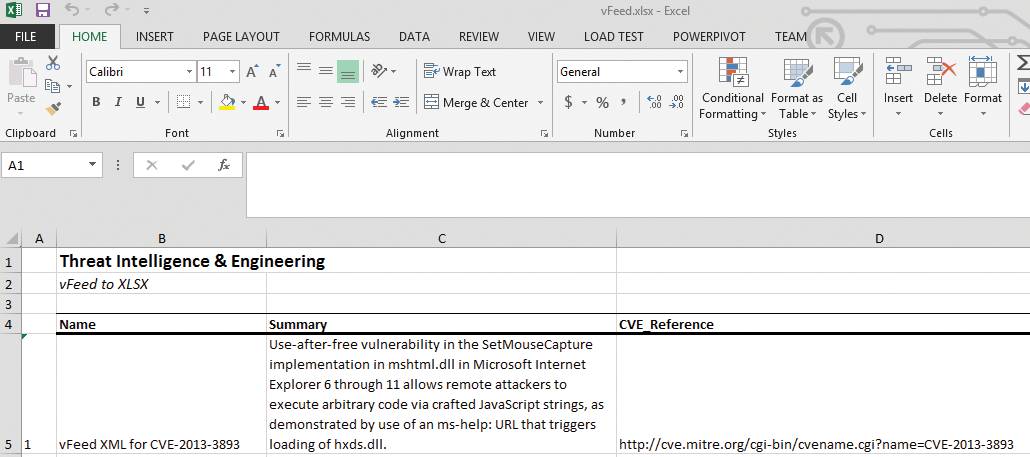
Whereas the XML file might have hundreds of nodes and children – as is often the case with STIX files – they'd all be tidily rendered in the spreadsheet as long as you've enumerated and defined them properly in your R script.
Although all this information might seem somewhat imposing, if you're neither an information security analyst nor an R programmer, I do hope this introduction to R has intrigued you at a minimum. Use this as an opportunity to install R, RStudio, the system dependencies, and the packages I used, and experiment with the scripts and the example datasets.
If you're properly motivated, you can read the Cookbook for R [9] and buy the R Cookbook [18] and R Graphics Cookbook [19]. Also remember that the Coursera Data Science offerings are a fabulous way to get underway with R. If you're ready to work specifically with information security data and R, remember to refer to the Data Driven Security website [20], which also includes related Python activities.
If you subscribe to the principles of "a picture is worth a thousand words," you should now be sufficiently compelled to begin your R practice or further enhance that which you've already established. Cheers, and feel free to ping me if you have questions.
