
Creating reports with JasperReports
Report Card
JasperReports [1] is an open source report generator written in Java that can integrate a wide range of data sources and output the results on the screen or as a file in a number of formats, including PDF, HTML, RTF, ODT, and CSV. It consists of multiple components whose common basis is the JasperReports Library.
The iReport, Jaspersoft Studio, and JasperReports Server tools expand JasperReports' capabilities. The server is needed if report updates must be generated on demand. These reports must be designed beforehand, which is accomplished by iReport and Jaspersoft Studio. However, the vendor is only supporting iReport until the end of 2015; anyone just starting with JasperReports would be better off trying Jaspersoft Studio, which is based on the open source Eclipse IDE.
Installation
Installing the design tools is essentially limited to unpacking components that are available on the community version download page [1]. You do need to watch out for one pitfall: On a 64-bit system, Jaspersoft Studio needs 32-bit versions of some libraries, such as libgtk-x11-2.0.so, which need to be installed separately. Otherwise, the application will not work.
Using ldd <Application/Library> shows which libraries an application or library expects. If details appear in the output such as
libgtk-x11-2.0.so.0 => not found
libgthread-2.0.so.0 => not found
libXtst.so.6 => not found
you will need to install these components retroactively. If the files are available and can be found via the search path but then cause the error message wrong ELF class: ELFCLASS64, the 32-bit version is missing.
Practical Example
Poached water fleas on green algae is the biggest seller in the fictional Animal Gourmet company's product range. Fish might not use big words, but they are loyal customers. Juniper-smoked mouse hams are big sellers with cats. When horses dine, however, the amounts sold are far larger; thus, in third place on the sales hit list is Summer Breeze aromatic hay.
All these facts count for nothing, however, if the Animal Gourmet CEO does not see them in a report that is formatted correctly according to corporate identity rules; embellished with logo, tables, and graphics; and updatable every week with fresh figures on demand. This is exactly what Max, the Animal Gourmet admin needs to investigate.
Fortunately, the figures on which the report is based are available in digital form in the enterprise resource planning database (Listing 1). Max has already looked around for a tool that he can use to make them all look as presentable as possible.
Listing 1: Enterprise Resource Planning Table
mysql> SELECT * FROM sales_fig ORDER BY productID DESC LIMIT 10;
+------------------------------------------+-----------+--------+
| product                                  | productID | sales  |
+------------------------------------------+-----------+--------+
| Gazelle tofu (vegan, with vit. A)        |      9987 |  532.7 |
| Poached water fleas on green algae       |      6547 | 1298.5 |
| Spicy spider legs (low-fat)              |      5211 |  432.6 |
| Antipasti from Aas                       |      4321 |    300 |
| Juniper smoked mouse ham                 |      3321 |  889.5 |
| Aromatic hay "Summer Breeze"             |      3003 |  776.1 |
| Butterfly mash "Power Pollen"            |      2017 |  399.6 |
| Grasshopper trotters, trad. Bav.         |      1001 |  646.8 |
| Silage sorbet                            |       113 |  411.3 |
| Young earthworms (piece goods)           |        18 |  461.4 |
+------------------------------------------+-----------+--------+
10 rows in set (0,00 sec)
A First Report
Max wants to generate a top 10 list of best-selling products for the first page of his reports. To do this, he starts the Studio application:
cd /home/Max/Apps/Jasper/TIBCOJaspersoftStudioPro-6.0.1.final
./Jaspersoft\ Studio\ Professional &
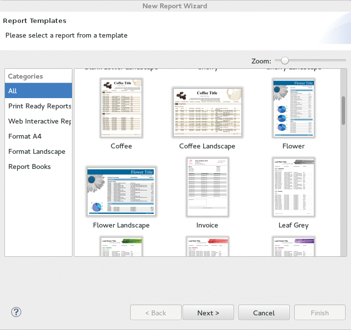
He accesses the New Report Wizard under File | New | Jasper Report to create a new report that initially provides an array of cross-format templates (Figure 1). Most of these already contain sample logos and charts as well as a table. Max can't find anything that suits his needs right out of the box, so he chooses the Blank A4 template.
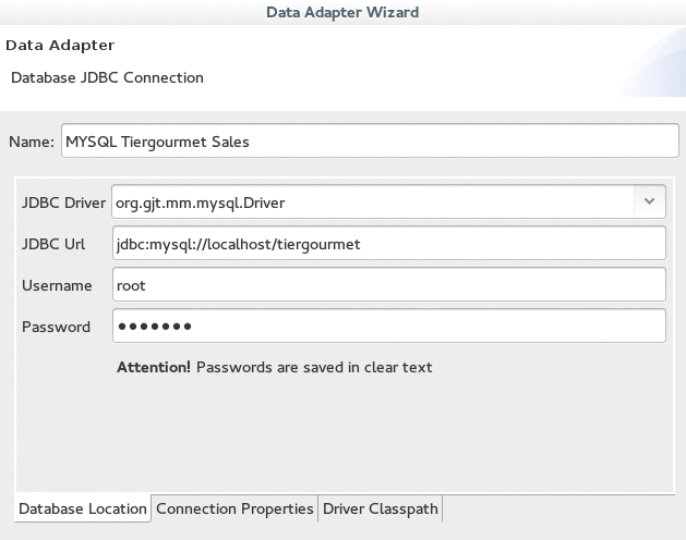
He then needs to specify a location for the new report. In the next step, the wizard requires he assign a data source. Max chooses Sample DB – Database JDBC Connection and clicks on the New button. This launches the Data Adapter Wizard. Max selects JDBC Connection and enters the basic information for the connection in his local ERP MySQL server in the form that appears (Figure 2). Under certain circumstances, Max might need to store the path to the Java class with the driver in the Driver Classpath tab.
You can now test the connection and confirm that the result was Successful. The last step of the data source wizard involves entering an SQL query to populate the report. For the top 10 list, this is:
SELECT product, sales FROM sales_fig ORDER BY sales DESC LIMIT 10;
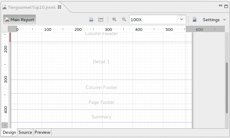
The design view appears with a clean sheet in which several horizontal report sections are marked (Figure 3). In JasperReport terminology, these report sections are called report bands. There are bands for headings or table headers at different levels and corresponding footers. One of the bands, the Detail band, behaves differently from the others. The report repeats whatever is placed in this band for each data record provided by the data source. This makes it possible to construct a report from a table or list.
You can retrieve everything positioned within the bands from a subwindow to the right of the design view. For example, using the Range and Properties tabs, a collection of elements that can be placed and displayed, including text lines, color fields, lines, images, and even complex elements such as charts or subreports. Another tab shows a properties dialog that precisely determines the properties of each element placed.
The elements can simply be dragged and dropped into the design view from the range; images can also be dragged from the desktop interface to the design and are automatically packed in an image element. You do not always need all the bands. If you do not need a particular band in a specific project, you can safely delete it in the design view by left-clicking in the band. Max only keeps the Title, Column Header, and Detail 1 bands for an initial top 10 list of best-selling products.
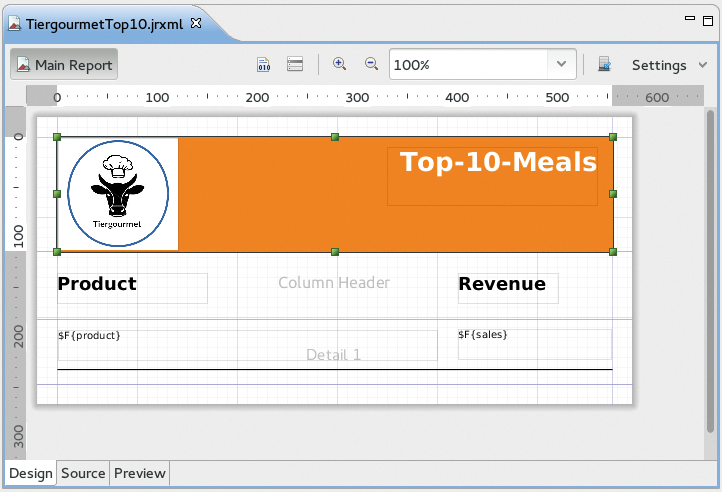
He drags a rectangle from the palette to fill the Title band, and paints it orange using the available properties (Forecolor, Backcolor). On this background, he drapes the company logo (an image element) on the left and a header on the right. The header's font, font size, and font color are determined in the properties of the corresponding element Static Text. Max assigns two further static-text elements (Product, Revenue), thereby forming a sort of table header in the Column Header band under the Title band for the listing that follows,.
The next band is the special Detail band. Its contents are associated with each data record provided by an SQL query that the user has defined together with the data source. The elements, which each receive the contents of a row value of a particular column from the SQL query, are called Text Element in the range.
It is advisable first to click on the small icon to the left of the plus magnifying glass so that the connection with the database query result set works. This is the Data Set and Query editor dialog. It should be set to the SQL query language and should include the following query for the top 10 list
SELECT product, sales FROM sales_fig ORDER BY sales DESC LIMIT 10;
A Read Fields button is at the top right in this dialog. If pressed, the column names for whatever values were requested appear in the lower half of the Field Name window together with an appropriate Java class type.
If Max places a Text Field element in the Detail band and then double-clicks it, a new dialog called Expression Editor opens. This makes it possible to link each text element with one of the newly found fields, behind which the database query columns from the data source are hiding. In this way, Max can connect the left text element with the product field and the right element with sales.
Max arranges a line from the palette under the two text fields. Because it is also repeated for each dataset in the Detail band, this results in a lined report. The finished design view looks like that shown in Figure 4. Now the first report is almost finished: Max just needs to click the Preview tab under the design view, and a preview of the report appears. If he were to select PDF instead of Java in the drop-down menu above the preview, the preview could be saved as a PDF.
More Data
At this point, the contents of the report show the results of exactly one SQL query. This may be sufficient in some cases, but a database that cannot be mapped with one single query is more typical, and Max has several options.
The first option I will look at here is again based on a single query whose results are distributed across different report elements. To accomplish this, Max queries a table or view in his enterprise resource planning database, in which columns list individual products, and rows contain daily sales volumes (Listing 2).
Listing 2: Sales Table
mysql> select * from sales;
+------------+----------+----------+----------+
| rdate      | product1 | product2 | product3 |
+------------+----------+----------+----------+
| 2015-03-02 |      577 |     284  |      156 |
| 3/3/2015   |      566 |     291  |      116 |
...
Max again starts with a blank A4 template. In this report, he wants to create graphics with daily sales figures for two products. No Detail band is required because the data record does not need to be listed line by line for this. Max only keeps the Title, Page Header, Column Header, Column Footer, and Page Footer bands.
Previously, he used the query with the data source definition
SELECT DATE_FORMAT(rdate, "%d.%m.%Y") \
  AS date, product1, product2, product3 FROM sales;
After doing this, he does not immediately click on Finish in the New Report Wizard. Instead, he clicks Next and ends up on a page where he can transfer all or individual dataset fields (here, date, product1, product2, and product3) to the fields that are then available for designing the charts. Max applies all the fields. In the next step, he could select fields to group by, which is not necessary here. This completes the wizard process.
Max designs the title with a logo and heading much like the last report. He then drags the chart element from the palette into the Column Header band. This opens a selection window that offers a wide variety of chart types – bar chart, pie chart, Gantt chart, and so on.
Max selects Line Chart and ends up on a page where he can define where the values for the two axes come from – the options are the fields that he chose above from the dataset fields. Not all fields are now required for the diagram – just a subset. Max chooses $F{product1} for the y-axis and $F{date} for the x-axis.
Next, he scales the diagram to the size of the band and places a static text field with a heading in the top Page Header band. Max then takes a first look in the Preview tab. In principle, everything is already working; however, the x-axis label (i.e., the date) cannot be read because the entries overlap, and a legend is not needed for a plot like this.
Both of these elements can be adjusted easily via diagram properties, with which all the display details can be changed. The x-axis label can be rotated through 30 degrees via Properties | Chart Plot | Category Axis Tick Label Font | Category Axis Tick Label Rotation so that the date marks no longer overlap. Additionally, the legend can be removed using Properties | Chart | Show Legend, which is False (Figure 5).
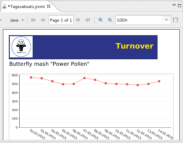
Max can now arrange a new heading and another chart for the sales figures of a second product in the two free bands following exactly the same approach. This can be done simply by selecting product2 for the y-axis values when configuring the chart. In this way, he can include as many different charts in a report as the product columns he specifies in his database query, and as many free bands as he still has for the charts.
No Limits
The next technique overcomes the limitations with regard to the number of data columns from a query and the free bands. Max simply drags the Subreport element from the palette into a free band. This step creates a report within a report and starts all over again: A new template can be selected, which in turn has all the bands available that a new report would have. Max can then define a new data source that can relate to a completely different query against a completely different table.
Max is able not only to place subreports in any free band (except for the Detail band) of a top-level report, but he can also nest them (i.e., create sub-subreports). Thus, there are almost no restrictions regarding design freedom.
Conclusion
JasperReports holds an entire array of possibilities that have not been discussed here: other chart types, maps, crosstabs, and more. The server can process any generated report on demand and can also accept parameters, such as a time interval, when calculating the report.
With JasperReports, you can reference anything that can somehow be expressed in numbers, charts, or tables to create continuously updatable, visually appealing reports with a uniform design and manageable overhead.
