
Visualizing data captured by nmon
In Good Time
An excellent article by Jeff Layton [1] on nmon monitoring showed nmon to be a most useful performance assessment and evaluation tool. My experience and use of nmon focuses on Layton's statement that "Nmon can also capture a great deal of information from the system and produce CSV files for postprocessing. However, the results are typically not easy to postprocess"; hence, you need a tool to visualize the data.
This is particularly true for big data firms that deal with thousands of Linux server systems and very large amounts of captured information. The visualized information needs to get into reports as quickly as possible, because the time to answer is paramount to be proactive. The bottom line can be based on the vast amount of nmon data; to get a comprehensive picture quickly of all server systems, you have to be able to drill down through the data to analyze individual servers' performance behavior on an ad hoc basis. To accomplish that objective, I've been using a tool at my company called onTune nmon Analyzer Plus (ONA Plus) from TeemStone [2].
ONA Plus: It's Fast
To use the tool, you first copy the nmon logs to the tool's directory. After the copy process, the application starts to load the files automatically. It takes about 20 minutes to process 10GB of nmon data (on a contemporary Windows laptop). In most instances, when dealing with a lot of nmon logs from thousands of servers, you can get a cup of java and come back to find the processing done.
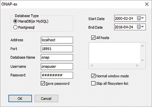
The tool pops up the window in Figure 1 right after the last logfile disappears in the tool's directory. To begin, you choose the start and end dates for the period of interest and select OK. The application processes the logs, executes a viewer program, and displays graphs and views.
It's Easy, Visual, Interactive
ONA Plus starts with the display shown in Figure 2, a Summary View of all server systems. The servers are grouped according to average/maximum values of CPU, memory, paging space utilization, and server count per grouping. You also can group the servers to reflect physical or logical separation of data centers and regions.
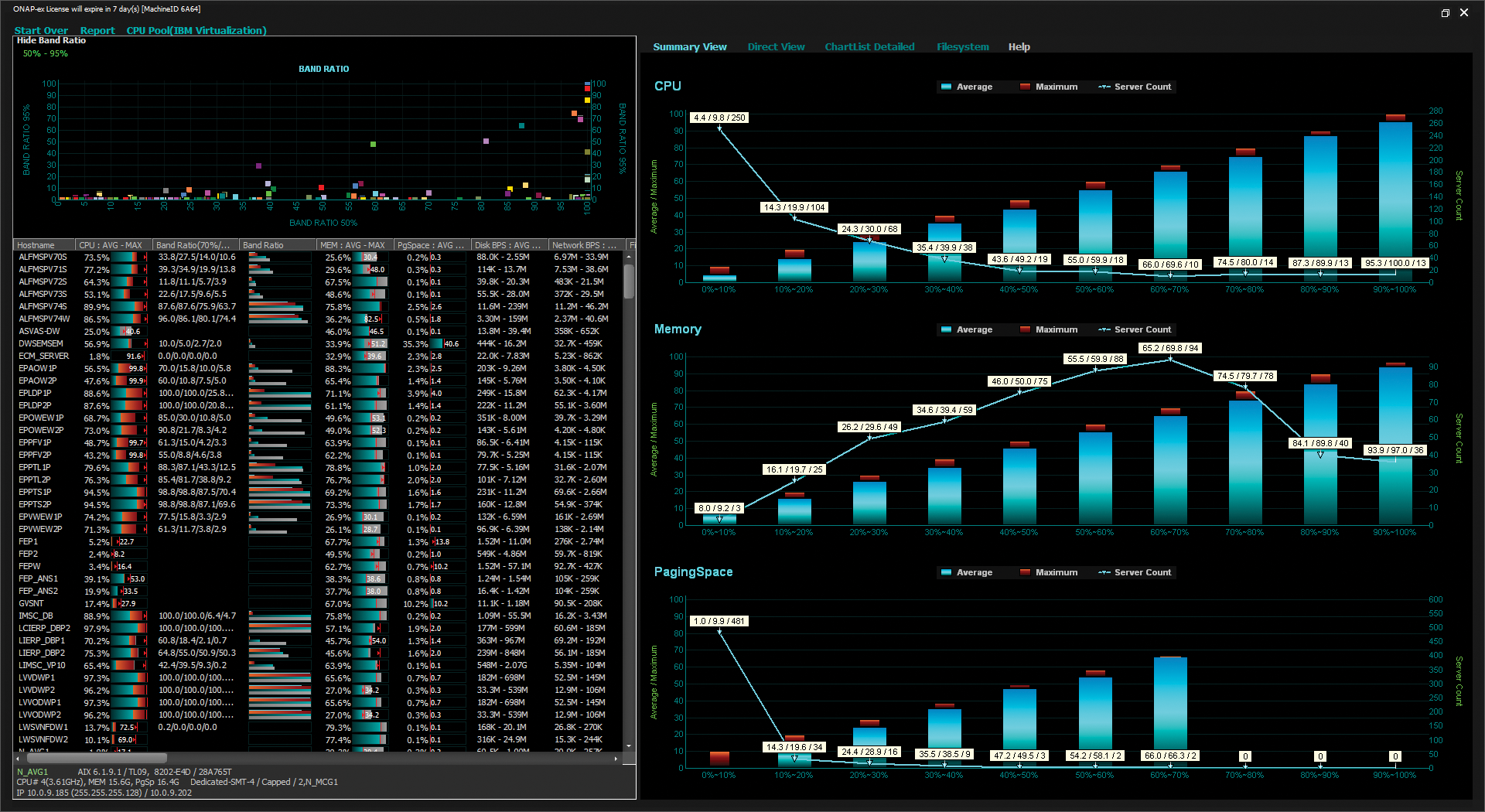
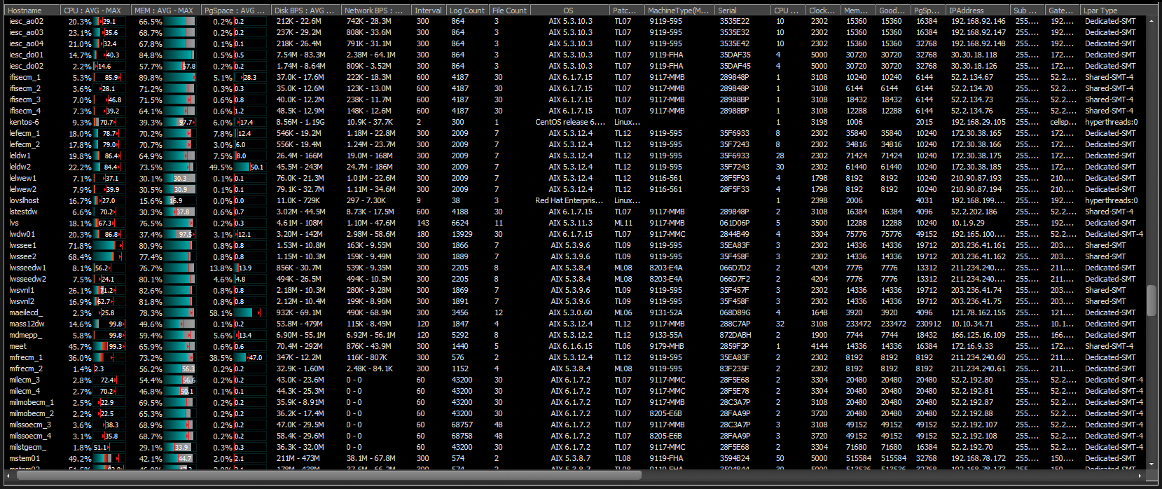
The server list on the left, and shown expanded in Figure 3, lists the main performance criteria for each server, as well as system information (e.g., CPU count, clock speed, memory, IP address). These nice features make it easier and more convenient for you to get a quick overview of your systems while focusing on the real performance analysis task at hand. I consider the list view to be most helpful and informative, because all the main performance information for each server is viewable at a glance.
Band ratio data, shown in the top left pane of Figure 2 and in the list window below, is a supplemental indicator used in conjunction with the average and maximum values to determine the load on a server. In my studies, I did not really have a need for the band ratio, so I usually just turned it off.
Drilling Down
To drill down through an individual server to analyze performance behavior, you can use the Direct View and the Chartlist Detailed view options. The Direct View option (Figure 4) provides detailed trending charts for each individual server's basic performance parameters (for a selected time range). To enhance the analysis process, a base chart is printed at the bottom of the application screen that depicts the entire time period and allows you to choose a smaller time epoch. Ergo, it is really easy to zoom in further and select a smaller sample period for analysis (Figure 5). Furthermore, you can choose the Predicting Trendline option to generate a simple forecasting graph.
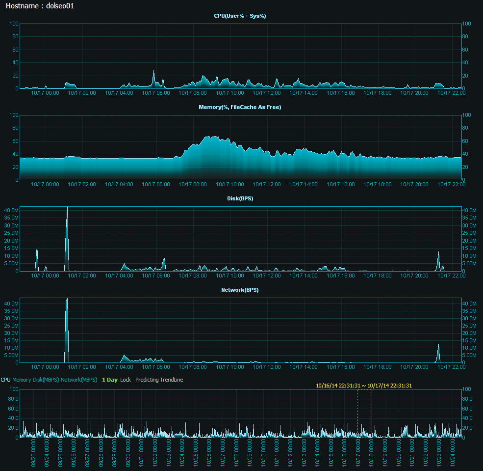

In most scenarios, a more comprehensive forecasting technique is required; nevertheless, an interesting feature provided with the tool can be used to assess, for example, CPU fluctuation via a sine wave. The view I have used extensively in projects is the Chartlist Detailed option.
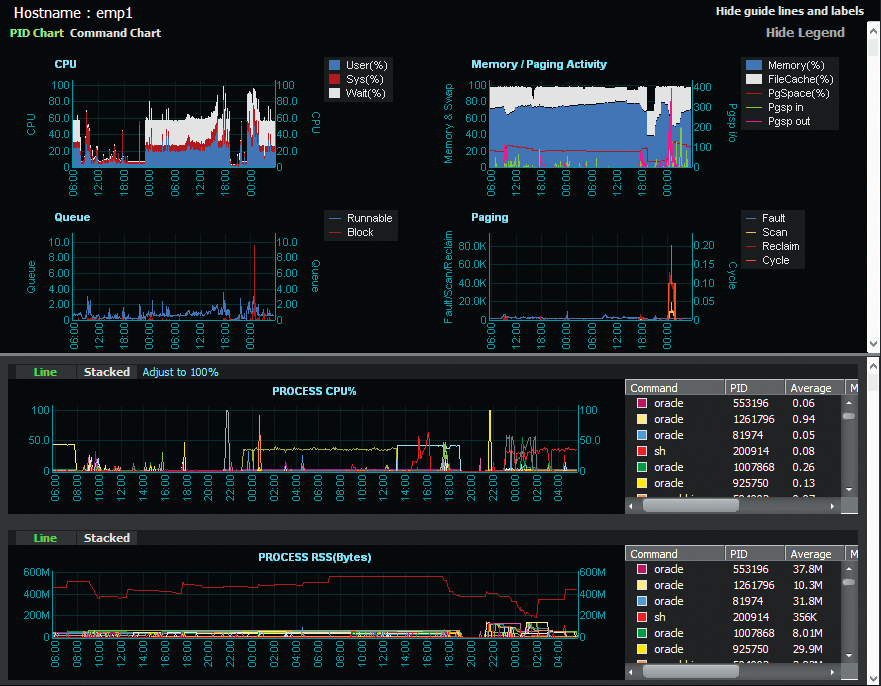
Here, you can display the process ID or command in a split screen directly below the basic performance items (Figure 6), so with the synchronized timeline, you can visually ferret out which process is the culprit underlying or has the potential for a performance bottleneck or anomaly. By providing all of these drill-down features in one analysis ecosystem, the tool can be used to conduct some serious server performance and tuning studies.
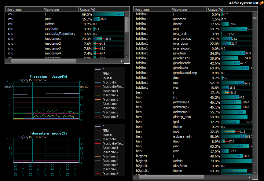
The Filesystem view (Figure 7) conveniently discloses all the filesystems of all the servers and their utilization (%) in one list, as well as detailed filesystem utilization charts on a per-server basis.
Real-World Scenario
A recent project at my company involved a fine-grained load test with the objective of monitoring performance in a rather short time epoch. To begin, I collect nmon data by entering the familiar command line,
./nmon -f -t -s 2 -c 1800
with a logging interval of two seconds, while using the nmon interactive mode to monitor the system. During the load test, I noticed an unexpected performance degradation (and CPU utilization spike; Figure 8). Nothing out of the ordinary really showed up because the time granularity was just too short to catch the anomaly.

A first hunch might be that the load program itself encountered a glitch or the system had a problem. Either way, I needed to identify the source of the problem and describe the reason for the anomaly.
Luckily, data visualization is an ONA Plus strength. In the Chartlist Detailed view for the respective server (for the test period), I was immediately able to visualize the situation. The excerpted process chart (Figure 9) shows that at the time of the CPU spike, the CPU resource was being consumed by a dd task that had nothing to do with the load test program per se.

Once I understood the source of the anomaly, I was able to restart the load test program (omitting the dd task) to see the expected processing behavior. This process further assured the repeatability and reliability of the load test without having to conduct a more extended troubleshooting analysis. These drill-down features, available within a single analysis ecosystem, are indispensable. (Later, the person who executed the dd was scolded a bit.)
Speed and Time to Answer
After continuing the load test for another six hours, I wound up with approximately 250MB of nmon logfiles. Those who use the nmon Analyser Excel spreadsheet [3] know that you cannot process logs of that size without first having to do some customization. However, ONA Plus ingested the 250MB of nmon files without a problem and had the results ready for analysis in less than 10 seconds. A couple of mouse clicks then specify any time period of interest.
Although I might have been able to accomplish the same results with the Excel nmon Analyser or the Python- or Java-based nmon analyzers [4] [5], which I also used before employing ONA Plus, analyzing vast amounts of data with these tools required a lot of preprocessing activities that were very labor intensive. More importantly, I could not obtain and provide the results needed within a reasonable time frame. In a lot of performance evaluation projects, time to answer is paramount!
Reporting
Another ONA Plus feature I like is the ability to create documents that report performance behaviors over a period of time (in this case, around 10 days). The above-mentioned load test was conducted to characterize a replacement scenario for an existing (older) system that had daily nmon monitoring and logging turned on. Once ONA Plus ingested the daily nmon files for the server being tested, the data was stored in the database, from which the results could be viewed and reviewed, regardless of the merging process of the logfile. Not only did I get a clear picture (Figure 10) of the results over the 10-day stretch, I could also easily move the results into Excel or any other reporting tool.

The capabilities discussed here are not limited to one server but expand to every server at any point on the timeline. In this article, I do not show the tool's ability to analyze nmon logs for a group or a number of servers, but daily, I use the tool to analyze high-performance computing systems with hundreds and thousands of Linux nodes. Considering that the simple load test generated a 250MB nmon logfile in approximately six hours, it is apparent that a tool such as ONA Plus is indispensable if you are using nmon to collect data on many server systems in your IT infrastructure.
Setting up ONA Plus
ONA Plus is available by subscription from onTune [6], or you can download a 30-day free trial [7] to try before you buy. A license for one Windows computer for one year includes all updates and releases, with remote support (email, fax, phone), available eight hours a day (US eastern time). The published price is $2,000 per year, but at the time of publication, onTune was having a limited-time offer of $1,500 per subscription.
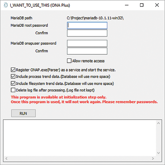
Once you have the software, setting up ONA Plus on your Windows laptop or PC is pretty straightforward. The tool comes with an easy install script that basically does everything for you. The easiest way to proceed is just to run the install tool (Figure 11), which performs all the necessary configurations and sets up the MariaDB database that is included with the download package. The install package is easy to use, and most of the installation files are just MariaDB files plus a few files for the tool itself. (See also the "Improvements" box.)
Summary
Visualizing nmon data in an efficient and effective fashion requires a tool that is fast, reliable, scalable, and easy to use. I have had very good experiences with ONA Plus analyzing very large logfiles from hundreds of server systems. The tool is speedy and true to the data, with a straightforward interface, and it comes with sufficient bells and whistles to guarantee a good user experience while providing accurate, valuable results.
